E-commerce Website Usability Testing & Redesign
Discover the usability issues of the current website and redesign it based on User Experience Usability Principles through an iterative design process.
CLIENT
Master Project
DURATION
11 Weeks
KEY SKILLS
Usability Testing, Prototyping, Testing
ROLE & TEAM
4MA UX Designers for Design Research & Individual Redesign/ Testing
The Problem
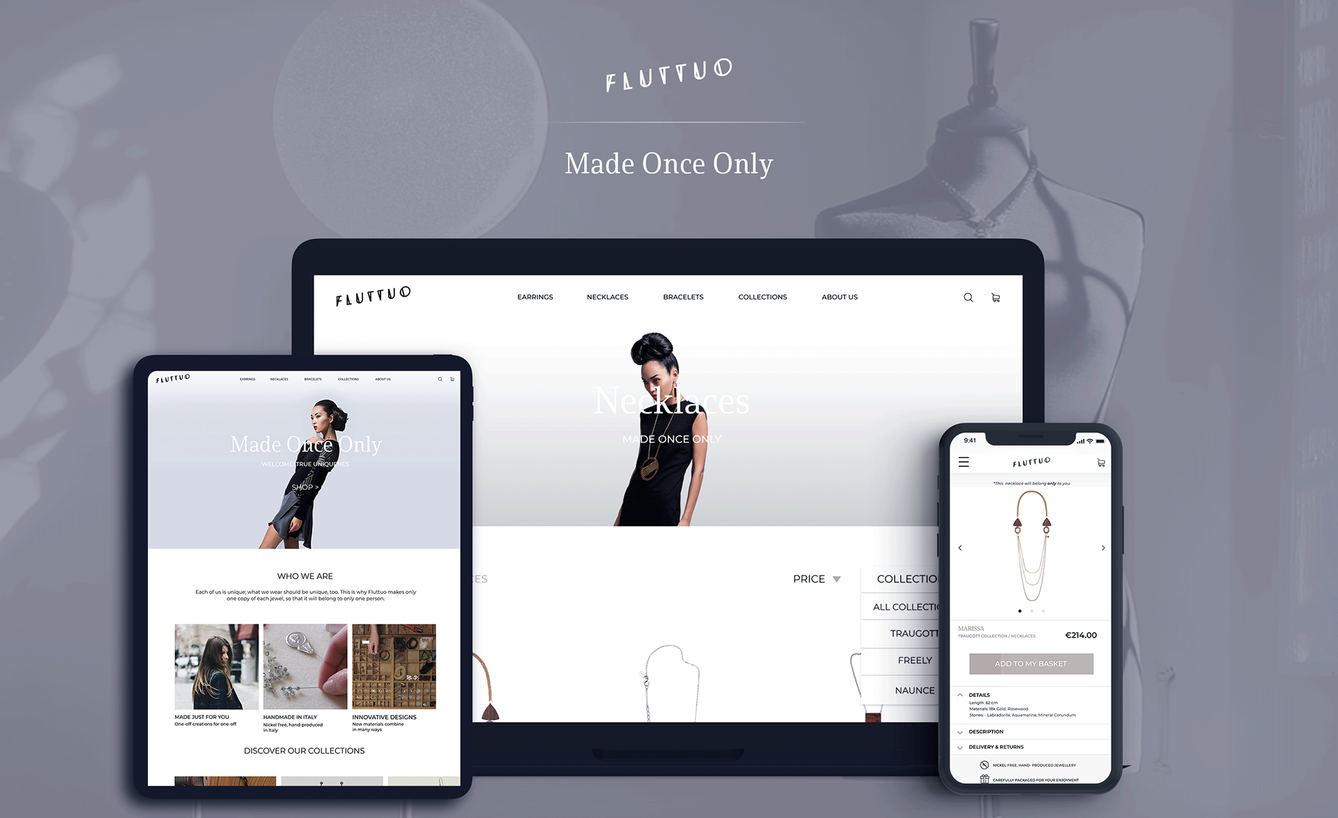
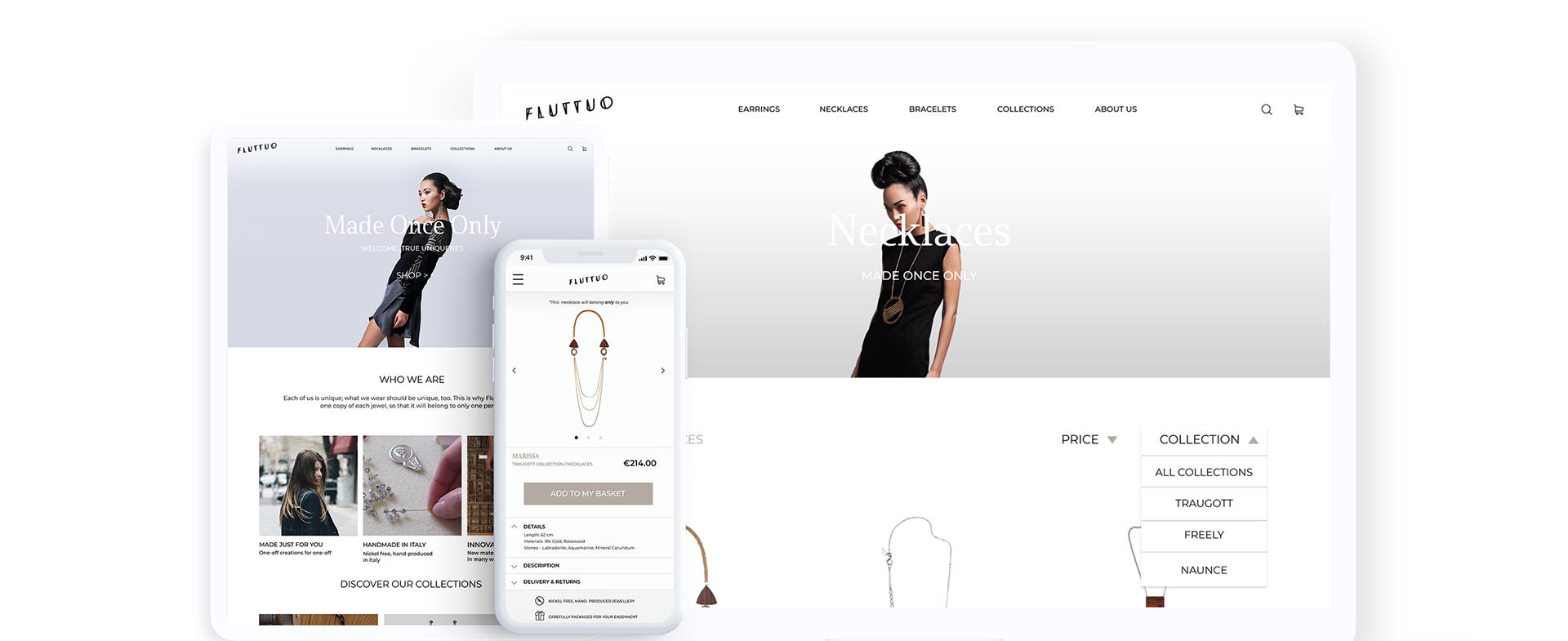
Founded in Italy, Flutto is a handcrafted jewellery brand. The brands current design of the website has usability and accessibility issues. Our brief was to work as a group of four researchers to conduct a usability assessment of the website, then split up and work individually to redesign the site, improving the user experience.
Project Aim
A new responsive design will match with the brand identity, and the changes will be made to address user needs as they spotted the in-depth user research. The ultimate goal is to improve the user experience of Fluttuo customers, and at the same time, it will increase the sales.
Design Process
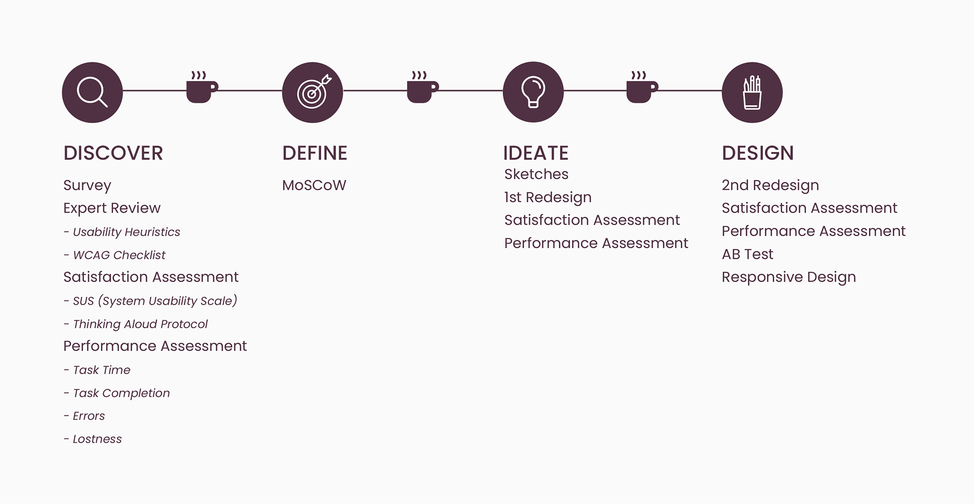
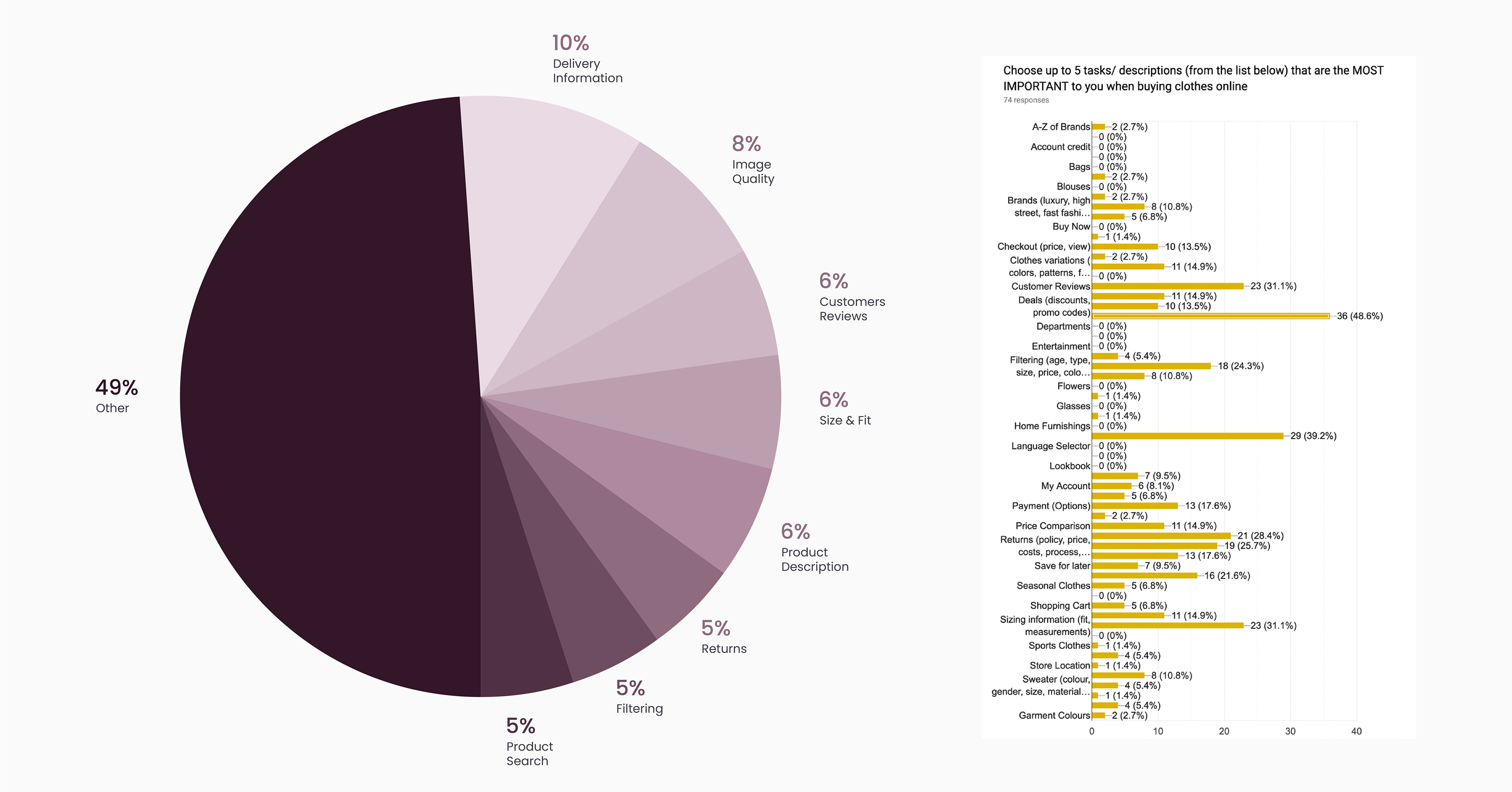
Top Task Survey
Before the usability test, a top task survey is done to find the tasks that the customers care the most when they purchase items online. The top task survey showed (74 people) that for shopping at fashion e-commerce websites, the top tasks are 1) Checking Delivery price and police, 2) Checking Image Quality, 3) Checking Customer Reviews, following by filtering and product search. The findings of the survey will guide the design decisions.
Expert Review Assessment
We necessitate running an expert evaluation to rapidly define usability and accessibility issues of “Flattuo” website. An expert evaluation is an efficient method that is used by many businesses to identify usability and accessibility problems quickly. It used the Nielsen Heuristics and WCAG 2.0 guidelines for usability and accessibility issues, respectively.
The investigation of Fluttuo Website focusing on key webpages:
• Home Page
• Search Results (Earrings)
• Product Page (Earrings)
• Checkout Page
• Home Page
• Search Results (Earrings)
• Product Page (Earrings)
• Checkout Page
After the data collection, the usability and accessibility problems are categorised and prioritised into Must Address, Should Address, Could address and Won’t address- MoSCoW method. The result is shown below.

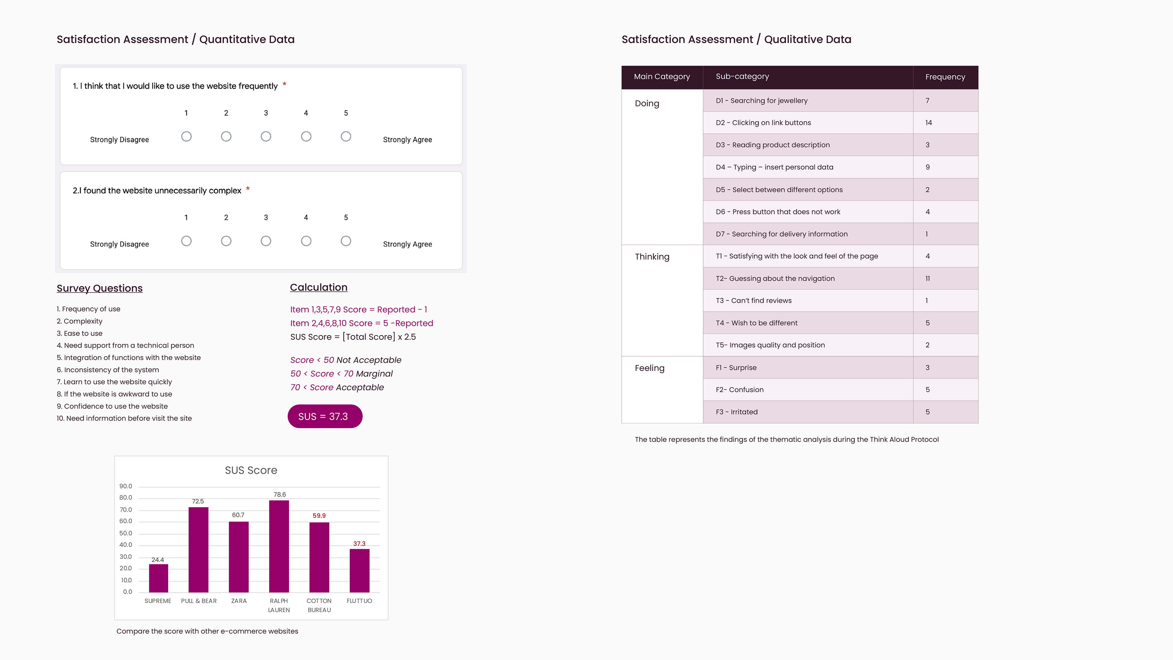
Satisfaction Assessment
One of the most critical metrics of usability is satisfaction. A positive experience is to increase user satisfaction, which means increasing the likelihood of the user to return to the site. We can measure satisfaction with both quantitative and qualitative data using surveys and observation, respectively.
SUS
To study the satisfaction of the website, the method used is the System Usability Scale which is a Likert scale for 10 questions. 27 Loughborough university user experience design students participated in the test. We collect data from users in the form of a survey. The survey includes a scenario and ten different After Scenario Question (ASQ). This procedure was repeated six times for six fashion retailers’ websites.
Think Aloud Protocol
To collect qualitative data, we ask our participants (2) to visit Fluttuo website, and then we gave them a scenario to found jewellery for a special occasion. During the browsing, we ask our participants to apply the think-aloud protocol, which means to talk through everything they are thinking and doing. To analyse data, we used the thematic analysis process. More specifically, after data collection, we highlight and code the key insights based on what are the participants doing, thinking, and feeling, and we also count the frequency of those tasks.
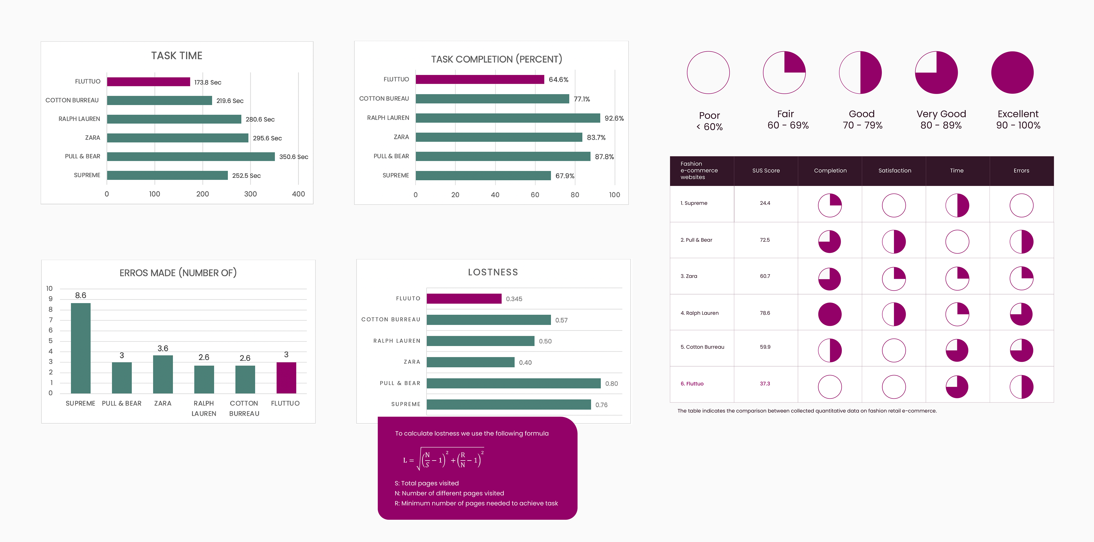
Performance Assessment
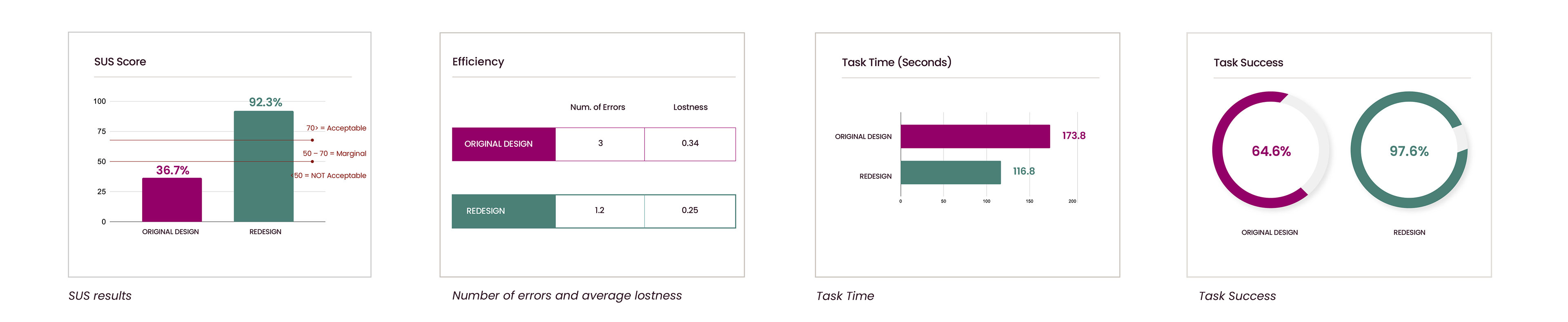
Performance is another important metric to measure the usability of a website. The higher usability of the website is deeply associated with the improvement of the performance of the website. There are four metrics being measured; 1) Task Completion, 2) Number of Errors made 3) Task Time and 4) Lostness/ Efficiency. The findings of this assessment will give us an overview of how Fluttuo website is performing compares to other fashion e-commerce websites.
27 Loughborough University MA User Experience Design students collect the data. The task of the test is to buy a present for a love one's birthday from the website.
Comparison Between Quantitative Data
Synthesis of Usability Issues
The most critical aspect of addressing the Fluttuo website is the navigation through the whole site. Currently, three different types of menus are not working properly and are confusing users.
The new design needs one consistent navigation menu.
Another issue is the hidden information about delivery and returns. Absent of quality images was also an important issue.
Besides, they are also accessibility issues that need to resolve with the new redesign and has to do with typography such as font size and colour.
Another issue is the hidden information about delivery and returns. Absent of quality images was also an important issue.
Besides, they are also accessibility issues that need to resolve with the new redesign and has to do with typography such as font size and colour.
Considering the previously mentioned usability and accessibility issues, we are going to redesign and test again that the suggested re-design can improve the digital experience of Fluttuo customers.
Redesign Considerations

First Iteration
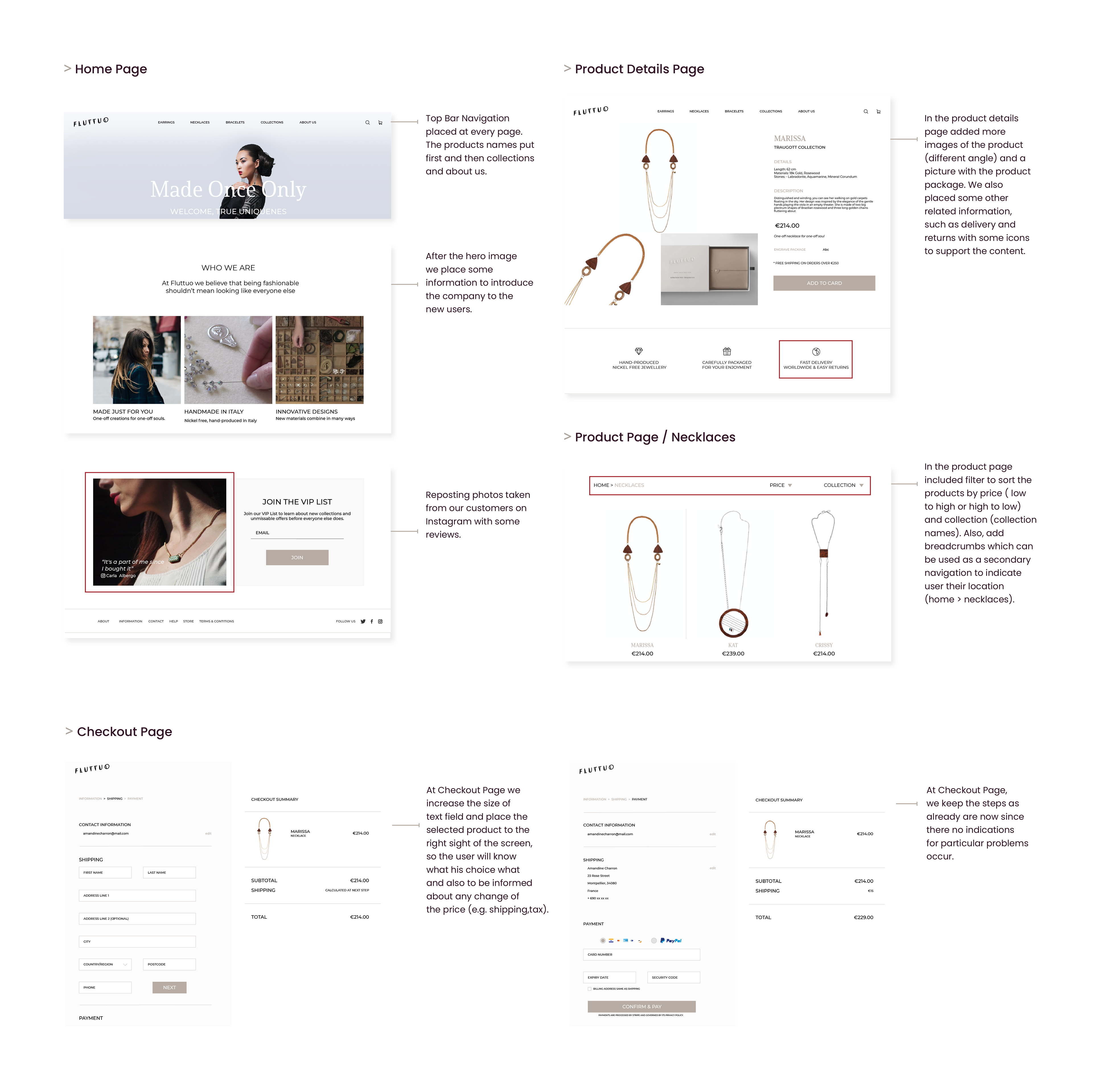
User Testing - First Iteration
For testing, the new Fluttuo designs used Performance and Satisfaction Metrics in a similar way that test the original design.
To evaluate the prototype, we gave participants certain task to do which were related to the top tasks that previous defined.
Required tasks for user testing:
1. Find a necklace
2. See the images
3. Read product description
4. Read customers feedback
5. Check delivery information
6. Check returns information
7. Add the necklace to the bag
8. Go to checkout
User Testing - Results

Usability Issues
Though the metrics were significantly improved from the original design, some changes need to be made to enhance the user experience further. Below are some of the user suggestions that they would like to see the new updated design.
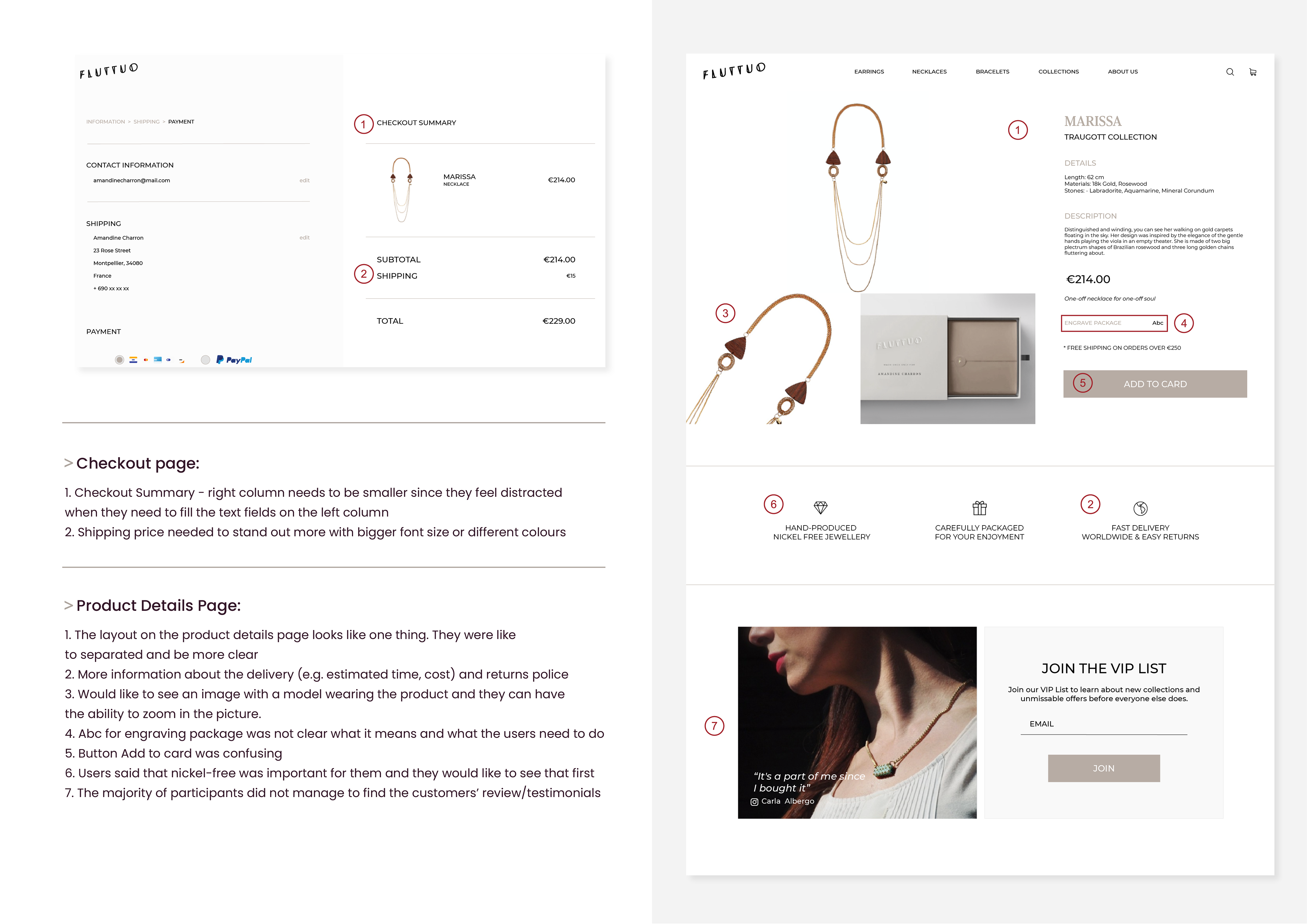
Second Iteration
Once the first iteration was completed, there are areas they need to change to improve the usability of the website. Considering users’ needs to iterative development cycle is vital, especially in e-commerce sites, since the company’s profit based on them.
Prototype Changes
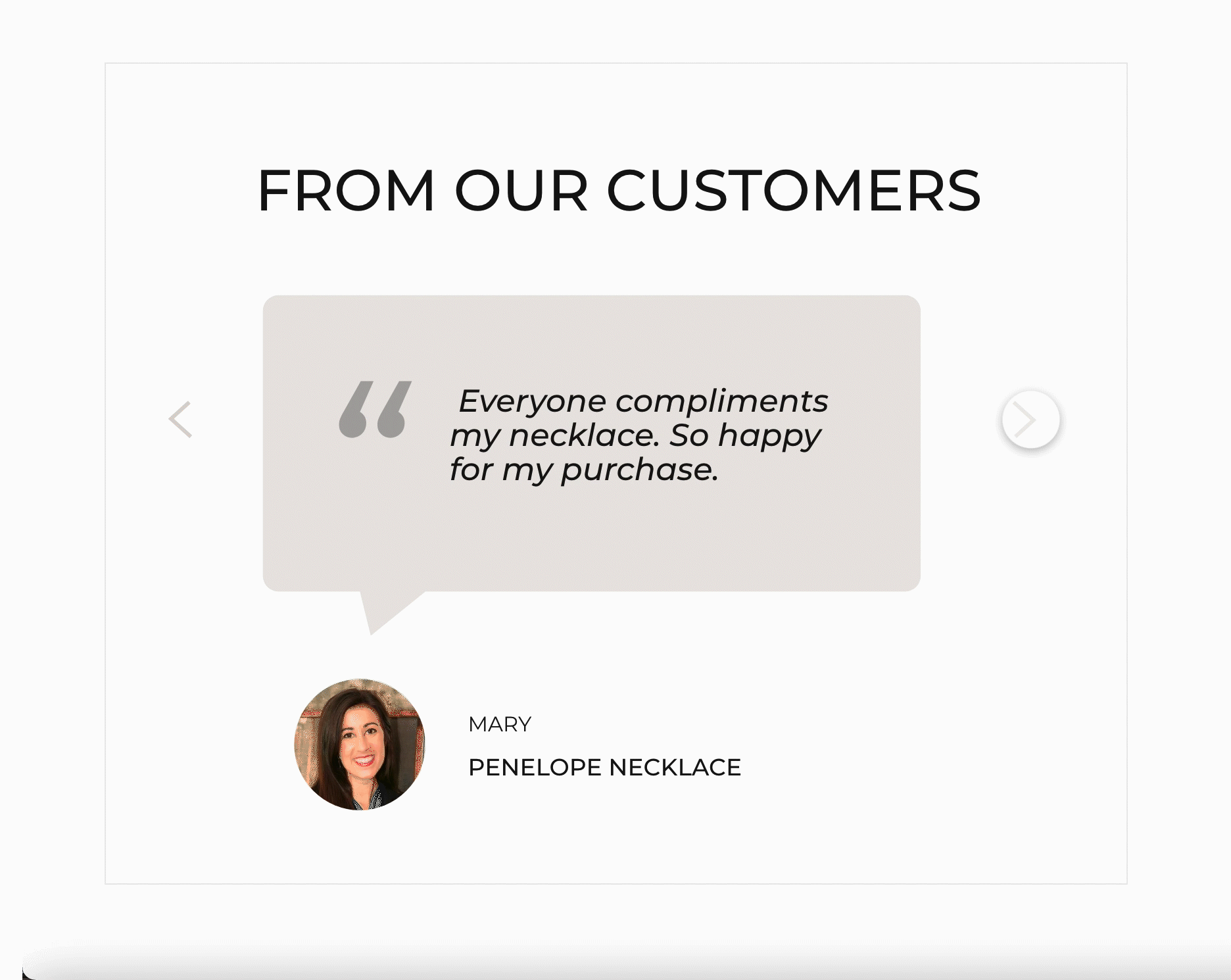
Customers Reviews
Testimonials cards redesigned from scratch. A photograph with the face and the name of the customer used. By doing this, not only the design was eye-catching, but it also increases the credibility of the brand as they are coming from a real person.
Product Page
Applied hoover interaction on the product image presenting the same item try on a model. Micro interactions like hover are highly visual feedback parts on user interfaces, and they can affect the engaging experience.
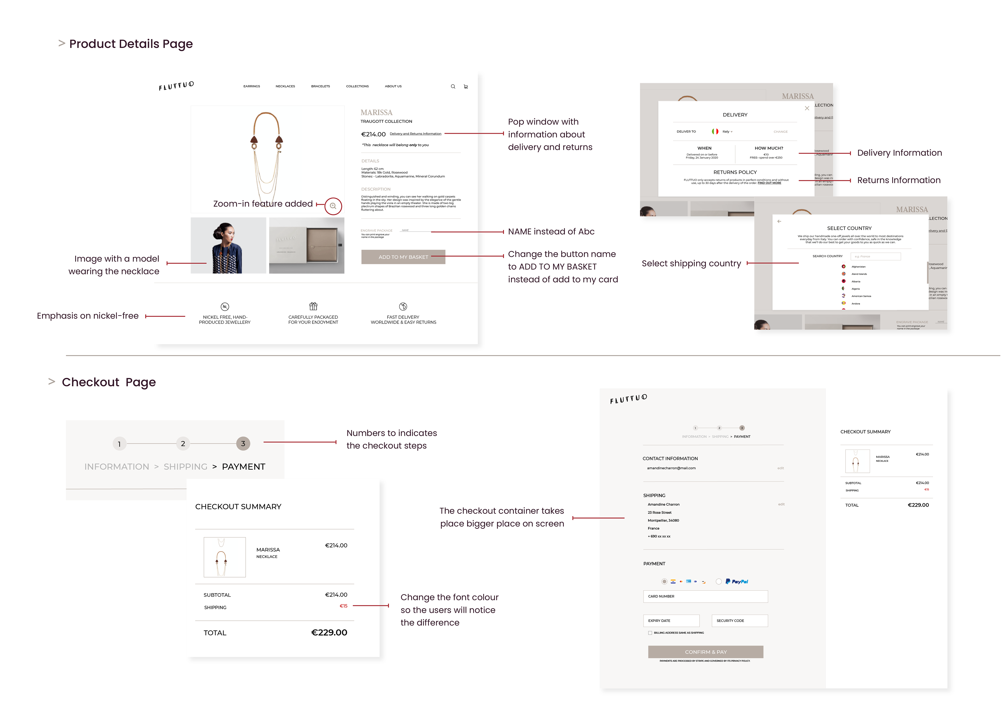
Product Page Details
First, dividers added to separate and make it more comfortable to read the information. Then, zoom-in feature placed on top of images in case the user would like to see the product closer. Also, to give more details about the delivery and returns, a link “Delivery and Returns Information” placed next to the item price. Last, the button add to card replace with the text add to basket.
Checkout Page
To illustrate better the steps, I add numbers and placed them in the cantered of the container. The checkout summary adjacent to box, the size of the images and text decreased. I also changed the font colour of delivery cost to stand out.
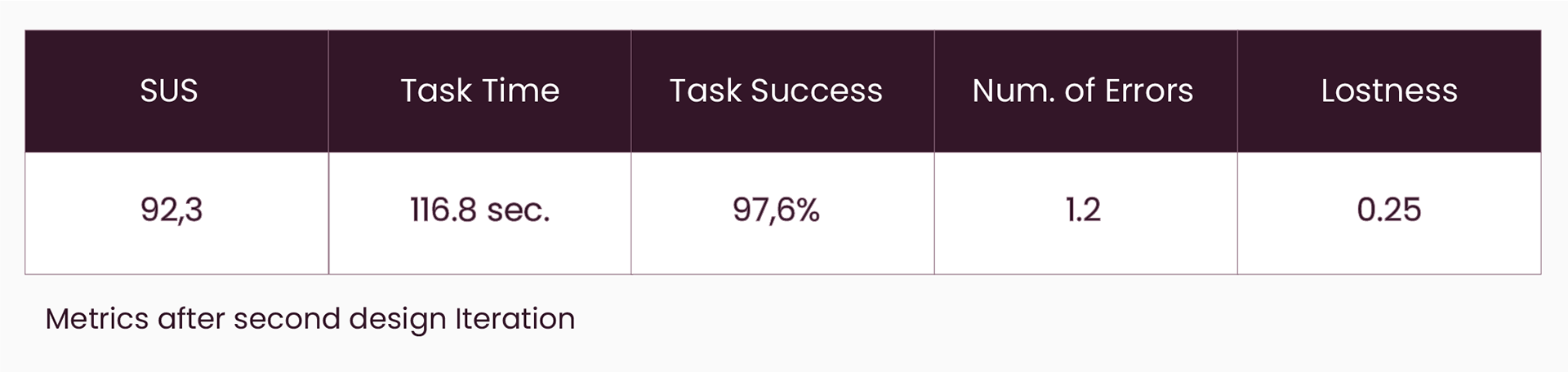
Changes made during the second iteration
User Testing - Second Iteration
To prove that the new changes affect the user experience positively, we need to repeat the user evaluation. The same metrics as first evaluation used - Performance and Satisfaction order to have comparable data. I also used the same number of participants as the primary testing: 13 people for SUS, two users for Think Aloud and six people for Performance. It is interesting to note at this point that the participants were different than from the first evaluation.
User Testing - Results
Responsive Design
The prototype builds in 12 columns responsive grid used to adjust the content correctly in any screens size. For smaller screen sizes, we adjust the design relatively to be easy to use.
Final Design
AB Test
We run an A/B test to measure the impact of design changes made compare to the original design. In A/B testing compared two alternative versions of a design to see which one performing better according to user testing.
As we can see from the metrics, both satisfaction and performance, the suggested redesign is more delightful for users and can significantly improve their experience using Fluttuo website.